Introduction
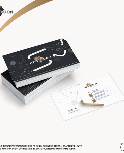
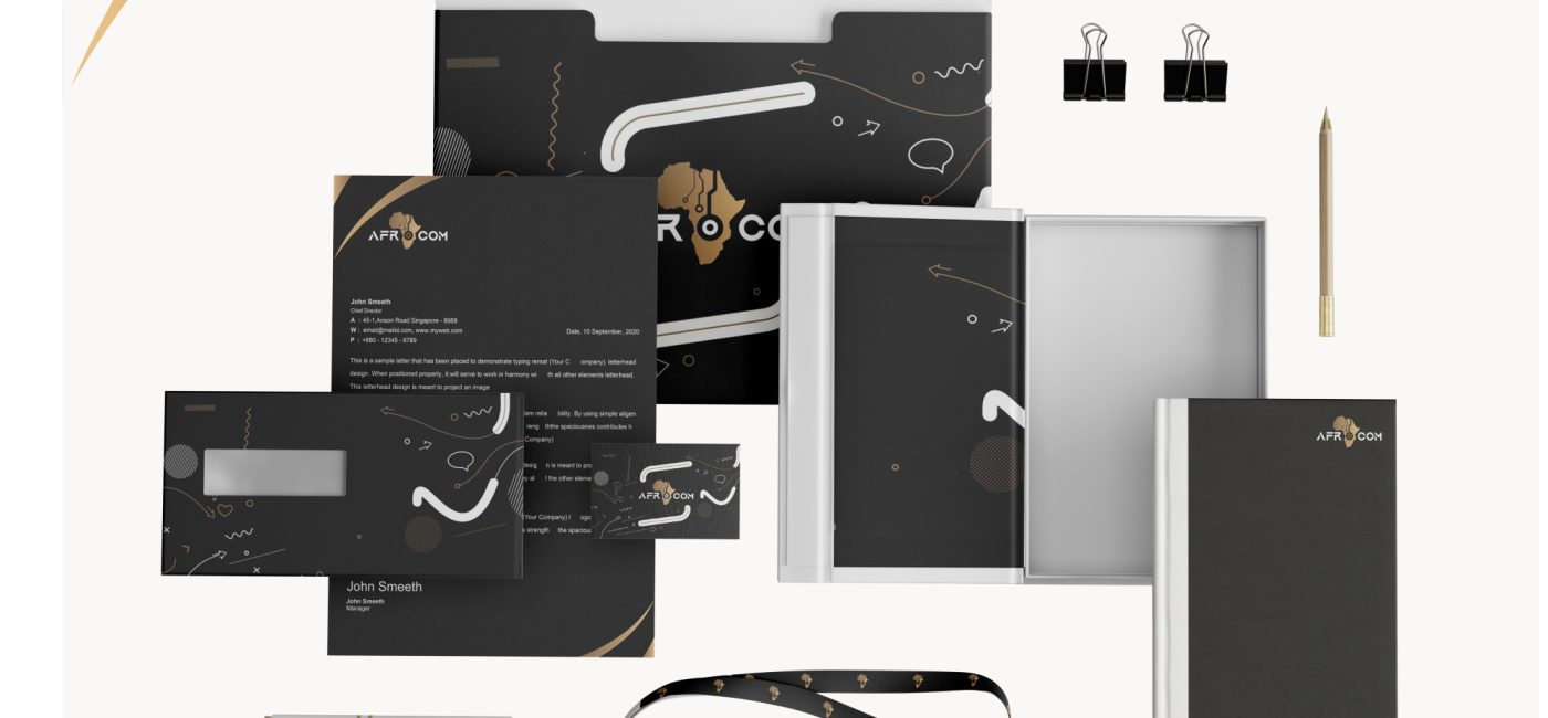
This project report details the design process and outcomes for the stationery set created for Afrocom, a company that specializes in African communication technologies. The design features a sophisticated gold and black color palette to reflect the brand’s elegance, professionalism, and commitment to excellence.
Design Elements
The stationery set for Afrocom includes the following items:
- Letterhead
- Lanyard
- Envelope
- Diary
1. Letterhead
Design Features:
- Header: The Afrocom logo in gold, placed on the top-left corner, ensures immediate brand recognition. The logo is paired with the company name in a sleek black font.
- Footer: Contact information, including address, phone number, email, and website, is presented in black text on a gold footer, creating a balanced contrast.
- Body: Ample white space for content, with subtle gold accents on the borders to maintain the elegant theme.
Visual Example:
2. Lanyard
Design Features:
- Strap: A durable black strap featuring the Afrocom logo in a repeating gold pattern. The gold adds a touch of luxury while the black base keeps it professional.
- Badge Holder: A transparent badge holder with a black and gold trim that complements the strap design.
Visual Example:
3. Envelope
Design Features:
- Front: The Afrocom logo prominently displayed in gold on the top-left corner. The recipient’s address area is clearly marked with gold borders.
- Back: The envelope flap features a black background with the Afrocom logo and tagline in gold, ensuring brand visibility upon opening.
Visual Example:
4. Diary
Design Features:
- Cover: A hardcover design in matte black with the Afrocom logo embossed in gold. This creates a sophisticated and professional look.
- Inner Pages: High-quality paper with a subtle gold margin, providing a unique touch to the writing experience.
- Bookmark: A gold ribbon bookmark to match the color palette.
Visual Example:
Challenges Faced
During the design and implementation of the stationery set, several challenges were encountered:
- Color Consistency:
- Challenge: Maintaining a consistent gold color across various materials (paper, fabric, plastic).
- Solution: Collaborated closely with the printing and manufacturing vendors to ensure color accuracy. Multiple sample checks were conducted to maintain uniformity.
- Material Selection:
- Challenge: Finding materials that were both aesthetically pleasing and durable.
- Solution: Extensive research and testing of different materials to find those that best met the design and durability requirements.
- Brand Integration:
- Challenge: Ensuring that all items reflect the Afrocom brand seamlessly.
- Solution: Created a comprehensive brand guideline document that detailed color codes, font types, logo placement, and usage rules, ensuring brand consistency across all stationery items.
- Design Approval Process:
- Challenge: Balancing the design expectations of different stakeholders within Afrocom.
- Solution: Regular meetings and design reviews were held to gather feedback and make iterative improvements, ensuring that the final designs met all stakeholder requirements.
Conclusion
The stationery design project for Afrocom successfully resulted in a cohesive and elegant set of office supplies that embody the brand’s values and aesthetics. The gold and black color palette not only enhances the professional look of the stationery but also ensures a luxurious touch, making a strong impression on clients and partners.
By overcoming challenges related to color consistency, material selection, brand integration, and the design approval process, the final products are a testament to the collaborative effort and meticulous planning that went into this project.
Visual Gallery
Here are the visual examples of the completed designs:
- Letterhead:
- Lanyard:
- Envelope:
- Diary:
Each of these items reflects Afrocom’s brand identity and enhances its professional image. The successful execution of this project showcases the design team’s capability to deliver high-quality, branded stationery.