Introduction
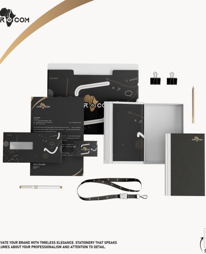
This project report details the design and development process of a new business card for Afrocom, a dynamic company specializing in telecommunications solutions. The business card utilizes a sophisticated color palette of gold and black, reflecting the brand’s commitment to excellence, elegance, and professionalism. The project includes concept development, design execution, and the challenges faced during the process.
Objectives
The primary objectives of the business card design project were:
- To create a visually appealing and professional business card that aligns with Afrocom’s brand identity.
- To incorporate the specified color palette of gold and black.
- To ensure the business card is functional and provides all necessary contact information in a clear and readable manner.
- To produce a design that stands out and leaves a lasting impression on recipients.
Design Process
1. Concept Development
- Research: Conducted thorough research on Afrocom’s brand values, target audience, and competitors’ business card designs to ensure a unique and relevant concept.
- Brainstorming: Generated multiple design concepts, focusing on the use of gold and black to convey a sense of luxury and sophistication.
- Sketches: Created initial sketches to visualize different layout possibilities and design elements.
2. Design Execution
- Color Palette: Chose a rich gold color to symbolize prosperity and success, complemented by a deep black to convey power and elegance.
- Typography: Selected a clean and modern font to ensure readability and maintain a professional appearance. Emphasized the company name and key information using gold to draw attention.
- Logo Placement: Positioned Afrocom’s logo prominently on the card, ensuring it is immediately recognizable.
- Layout: Designed a balanced layout that provides ample space for the logo, contact information, and any additional elements such as social media icons.
- Finishing Touches: Added subtle design elements like a gold border or embossed logo to enhance the tactile experience and visual appeal.
3. Review and Refinement
- Feedback: Presented the initial designs to Afrocom’s stakeholders and gathered feedback.
- Revisions: Made necessary adjustments based on feedback, refining the design to better meet the client’s expectations.
- Final Approval: Secured final approval from Afrocom’s management before proceeding to printing.
Final Design
The final business card design features:
- A black background with gold accents, creating a striking contrast.
- Afrocom’s logo prominently displayed in gold.
- Contact information in an easy-to-read format, with important details highlighted in gold.
- A sophisticated, minimalist layout that ensures clarity and elegance.
- Optional elements such as a gold-foil embossed logo and gold-bordered edges for a luxurious touch.
Challenges Faced
1. Color Balance
Achieving the right balance between the gold and black colors was challenging. It was essential to ensure that the gold accents were prominent enough to convey luxury without overwhelming the overall design. Several iterations were necessary to strike the perfect balance.
2. Readability
Ensuring readability against the black background was a significant challenge, especially for contact details. Careful selection of font type and size, as well as strategic use of gold for highlighting, were crucial to overcome this issue.
3. Printing Quality
Reproducing the rich gold color accurately in print required selecting the right printing techniques and materials. Ensuring consistency in color and quality across different batches was a concern that needed meticulous attention to detail and coordination with the printing vendor.
4. Stakeholder Alignment
Aligning the design with the vision and expectations of all stakeholders at Afrocom required multiple rounds of feedback and revisions. Balancing different perspectives and preferences while maintaining the integrity of the design was a complex process.
Conclusion
The business card design project for Afrocom was a successful endeavor that resulted in a high-quality, elegant business card aligning with the company’s brand identity. Despite the challenges faced, the final product met all the objectives and received positive feedback from the client. The use of gold and black colors effectively conveyed a sense of luxury and professionalism, making the business card a valuable tool for Afrocom’s branding and networking efforts.
Recommendations
For future design projects, it is recommended to:
- Conduct detailed initial consultations to fully understand client expectations and preferences.
- Allow for multiple rounds of feedback and iterations to refine the design.
- Collaborate closely with printing vendors early in the process to address potential color reproduction issues.
- Explore various finishing techniques to enhance the visual and tactile appeal of printed materials.
By following these recommendations, similar projects can achieve high-quality results that effectively represent the brand’s identity and values.


